It’s Showtime!
This was my first case study while learning UX/UI design with Google’s UX Design Certification. I was given an auto-generated prompt to design an app for a local movie theater that would allow the user to view movie trailers. The idea was to make something simple and streamlined that would be accessible for everyone to use.
Problem Statement
A local movie theater needed a mobile app to allow users to view movie trailers. This would allow the user to watch a trailer without leaving the app, followed by selecting a showtime and purchasing a ticket.
Usability Testing
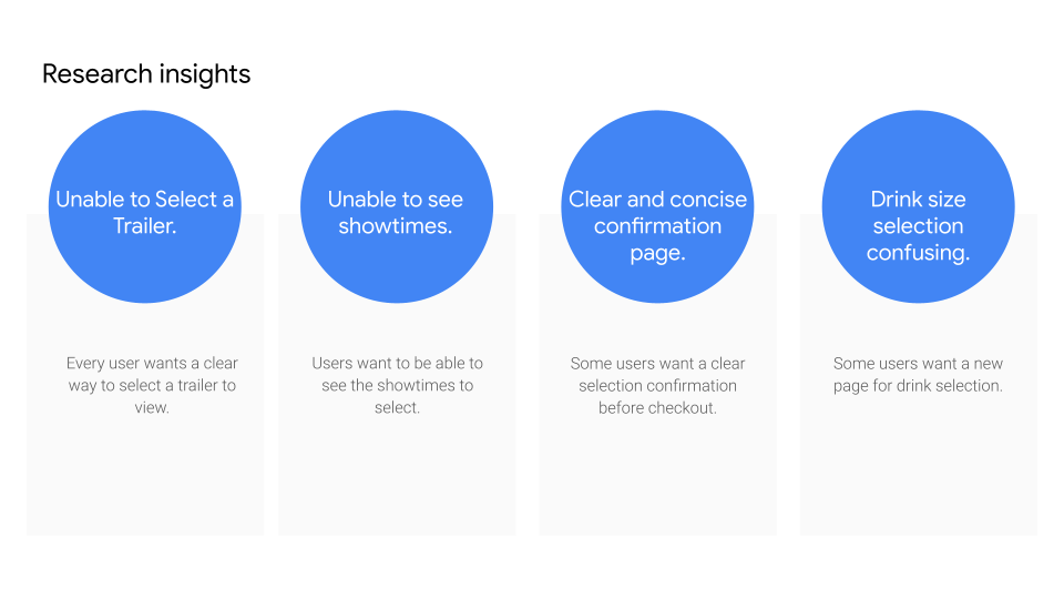
For the usability testing I interviewed 5 participants to get insight on potential pain points as well as positive features and create themes based on these insights.
Recommendations
Make a new way to select a trailer as well as make a high fidelity prototype with more detail to make the selected trailer obvious.
Update the showtimes page to reflect the actual showtimes for that particular day in a high fidelity prototype.
Make a confirmation page.
Add a new page for concessions.
Solution
This was a solo project so I started with some design ideas of my own. I did a competitive audit of Marcus Theaters, Alamo Drafthouse and Fandango. They all had positive and negative design elements to them. In particular, I thought two of them were a little cluttered with rather small buttons close together. I wanted to make the flow of the app very simple by offering one main option per screen and provide larger buttons and fonts for accessibility.
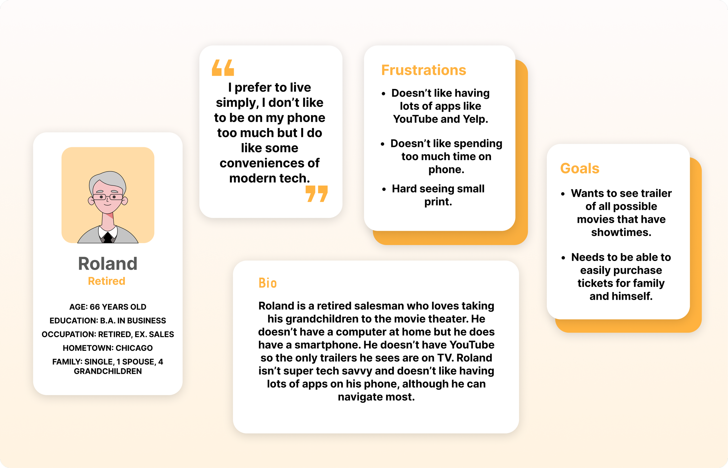
Personas

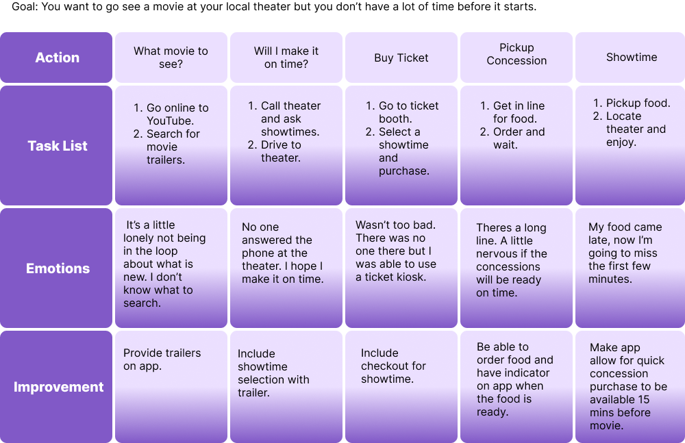
User Journey Map
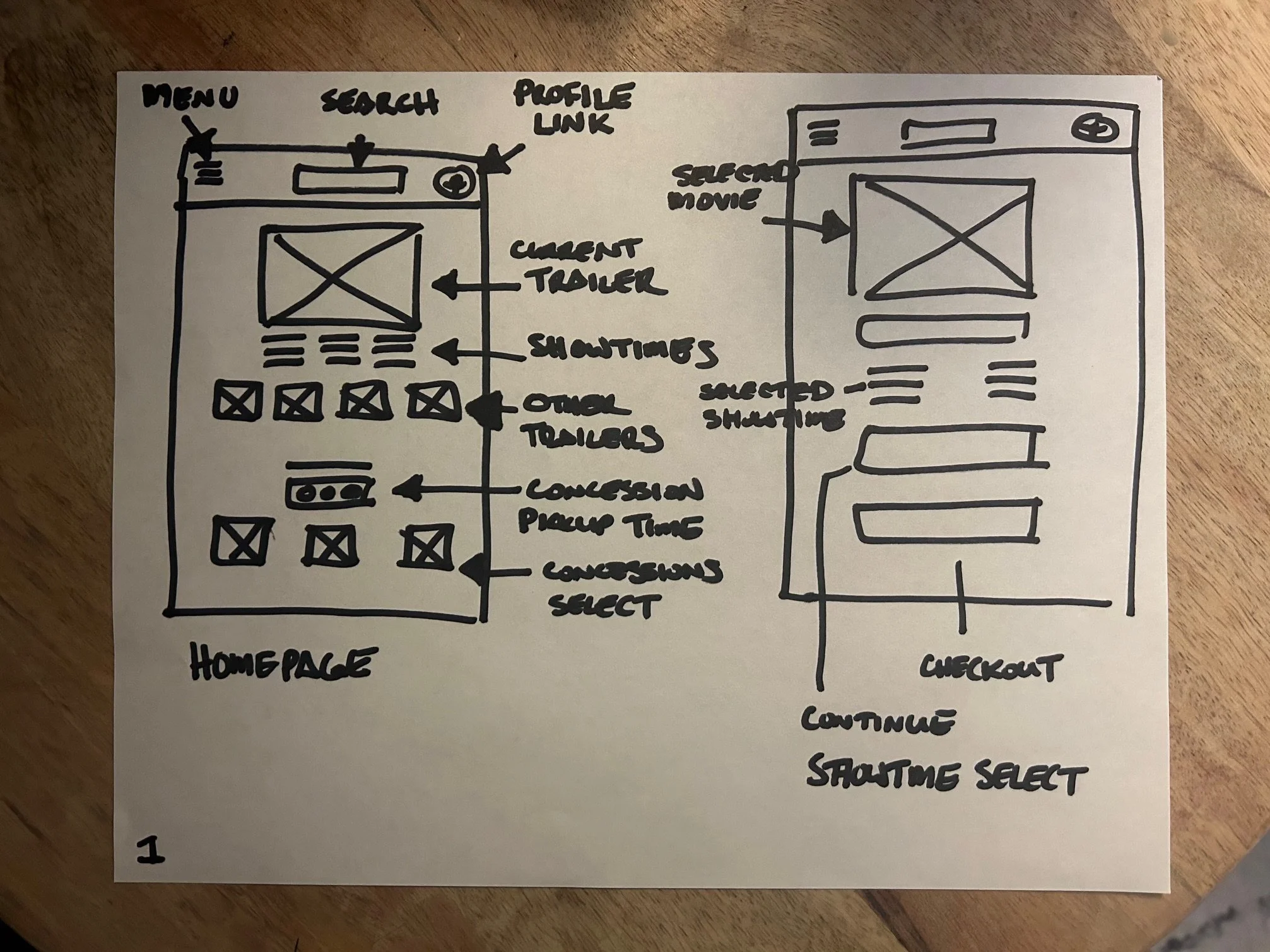
Paper Wireframes


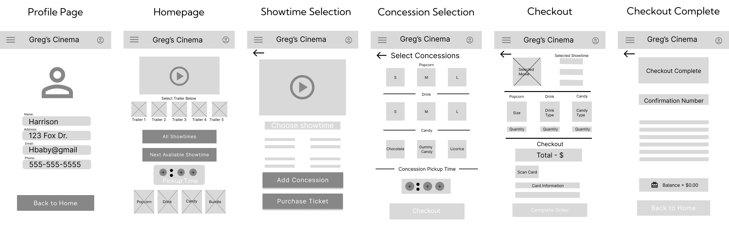
Digital Wireframes
Here you can see I have turned my initial paper wireframe into a digital one. After some usability testing I realized there needed to be some quick changes. I learned that you may feel the need to make different design choices while using a different medium. For example, I created all the screens I needed, but I didn’t think about how you were going to move from one to the other without any navigation buttons.
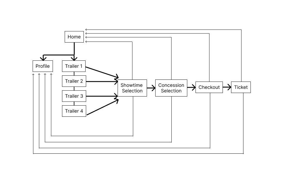
Information Architecture
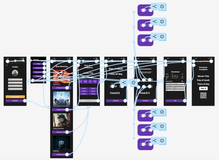
The Information Architecture was made to be very simple with this app. I wanted the app to guide you to the final checkout. I achieved this by narrowing down each screen to only contain one or two user options. For example, when on the showtime page, you cannot proceed until you select your date and time. Once that is completed, you then have the option to go forward although you can move back a page at anytime. You may also use the navigation menu button at the top left as a second option.
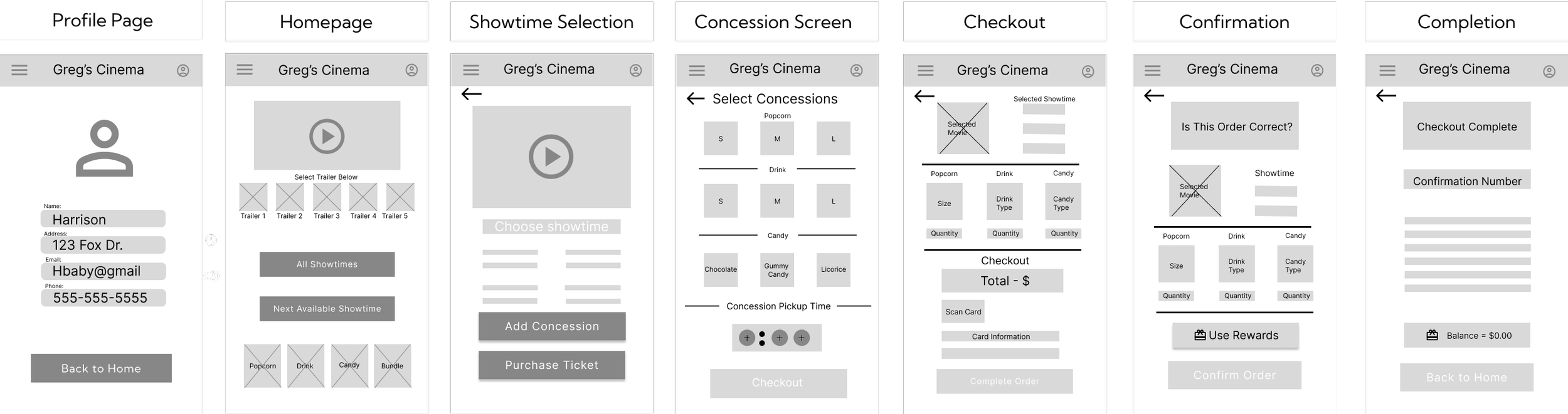
Low Fidelity Prototype
Here, you will see I corrected some of the issues from the first digital wireframe. Specifically adding navigation buttons to move from screen to screen. Based on the usability testing I decided to add a confirmation page before checkout so the user can make sure everything looks correct before moving forward. I also removed the concession pickup time feature from the homepage.
Design Iterations
Here is my initial high fidelity prototype iteration. The first thing you notice is how different the color scheme is to the final product, mainly un-inspired white and green.
Secondly, this was when I still had the movie trailers in small thumbnails that were to be selectable for the user. Testing showed this was too small and confusing.
Lastly, the concession pickup time was removed since it was completely unnecessary.
When coming up with a color scheme, I drew inspiration from a local now defunct movie theater company called Weherenberg Theaters. I used some of the colors in their fanfare that would play before a movie started. I also liked the idea of making the background black to mimic the cool dark feeling of being in a movie theater.
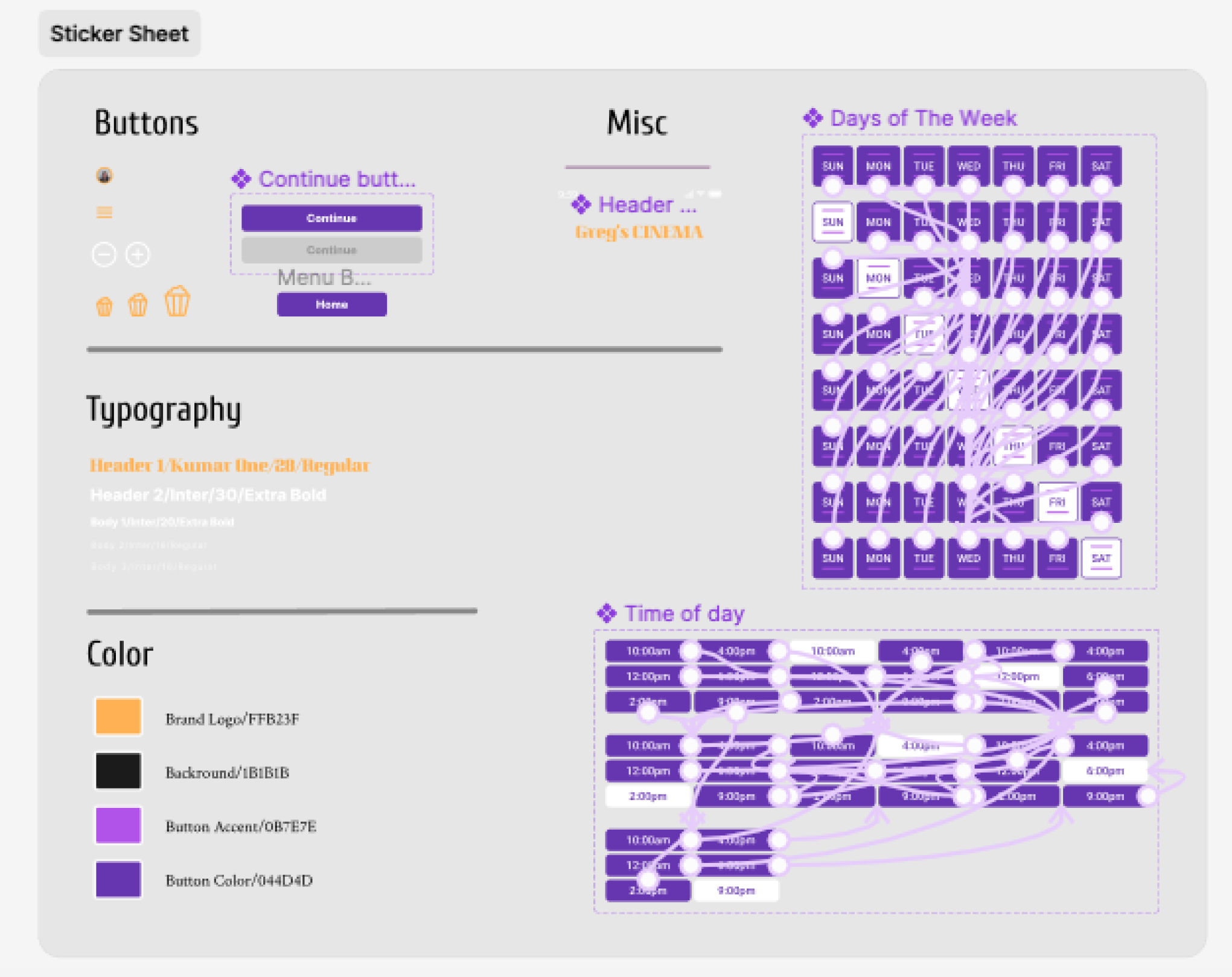
I wanted the buttons to work in real time like that of a completed product so I wrote variables for each button. I created the days of the week buttons to scroll to the left so you could select with your thumb. This took a lot of time and was confusing at first. Eventually I got a grasp on it and I think the buttons function and flow very well.
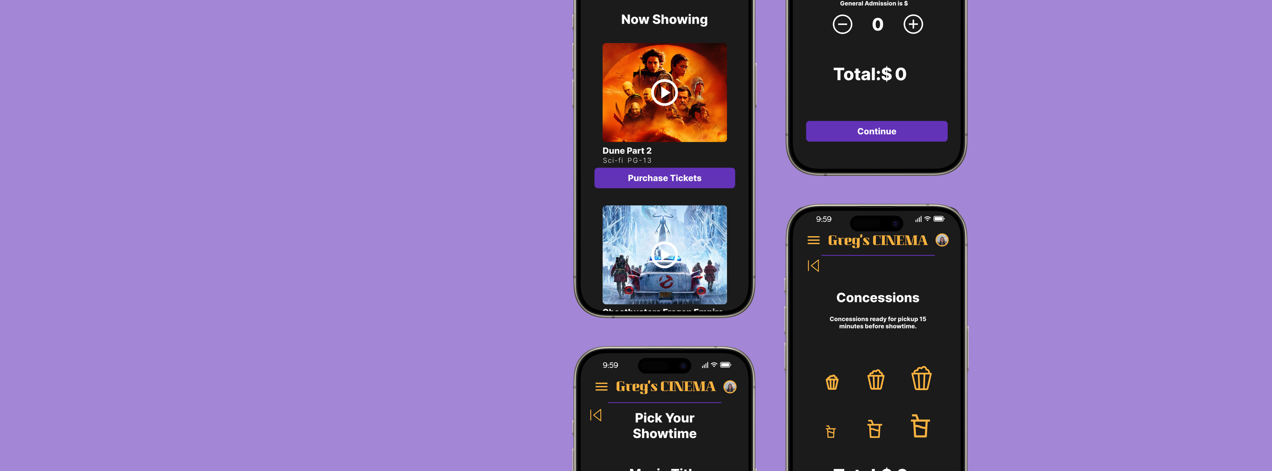
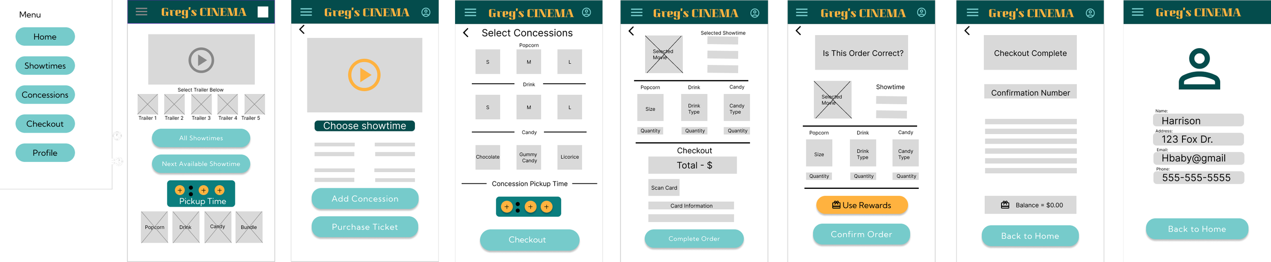
High Fidelity Prototype
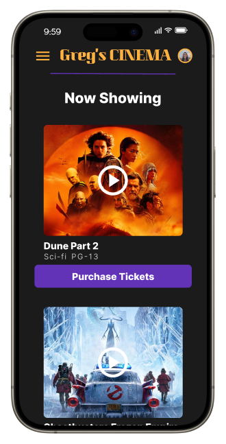
As you can see, the biggest change is the overall look due to the color scheme. I like the dark background since it reminds me of the comfort of a dark, cool movie theater. Most of the buttons are either a purple or gold to make it simple for the viewer to see even in a dark mode style visual.
Next was accessibility. I wanted the user to navigate the app with just the use of their thumb. To do this I limited the options on each page so there would be larger target points. I also included the price from screen to screen so as you progress you don’t have to wait until the checkout screen. Finally, I included simple symbols like the plus and minus for increasing quantity or the large and small popcorn buttons. This created simple visual queues and again, ease of use for all appropriate ages.
Final Design

What I Learned
There was so much I did not know before starting this project. Learning the whole process from start to finish was eye-opening. It created a guide that would otherwise not be there.
This was my first experience with Figma and I found it very intuitive. Creating components and writing variables was a challenge but it helped me grow as a designer.
In the future I would add other features such as reserving your own seat, and greater selection of concession items. Ultimately, being my first solo case study, I am proud of how it turned out.