
Background
For this case study, I wanted to see if I could improve an existing phone application.
I chose to redesign the Taco Bell app since my family uses it from time to time and I noticed areas that could be improved.
This project was done solo and was set to be completed in 2 weeks.
Quantitative Research
Upon doing research I found some interesting statistics that informs and adds context to this redesign.
2 in 3 People consume fast food at least once a week.
On average consumers spend $148 on fast food a month.
Specifically 54% Millennials report eating fast food a few times a week with 23% eating it daily.
10% of all customers buy online for pickup later.
Millennials report online food delivery as their top preference for purchasing fast food.
77% of Millennials and 62% of Baby Boomers chose their fast food by quality of food.
68% of consumers chose quality of food over 62% chose price.
Statistics provided by driveresearch.com
Competitive Audit
McDonalds
Starbucks

Chick-fil-A

Wendy’s


Affinity Diagram
After interviewing the four participants, I took all of their feedback and arranged it into an Affinity Diagram to use the pain points to form insights and themes.
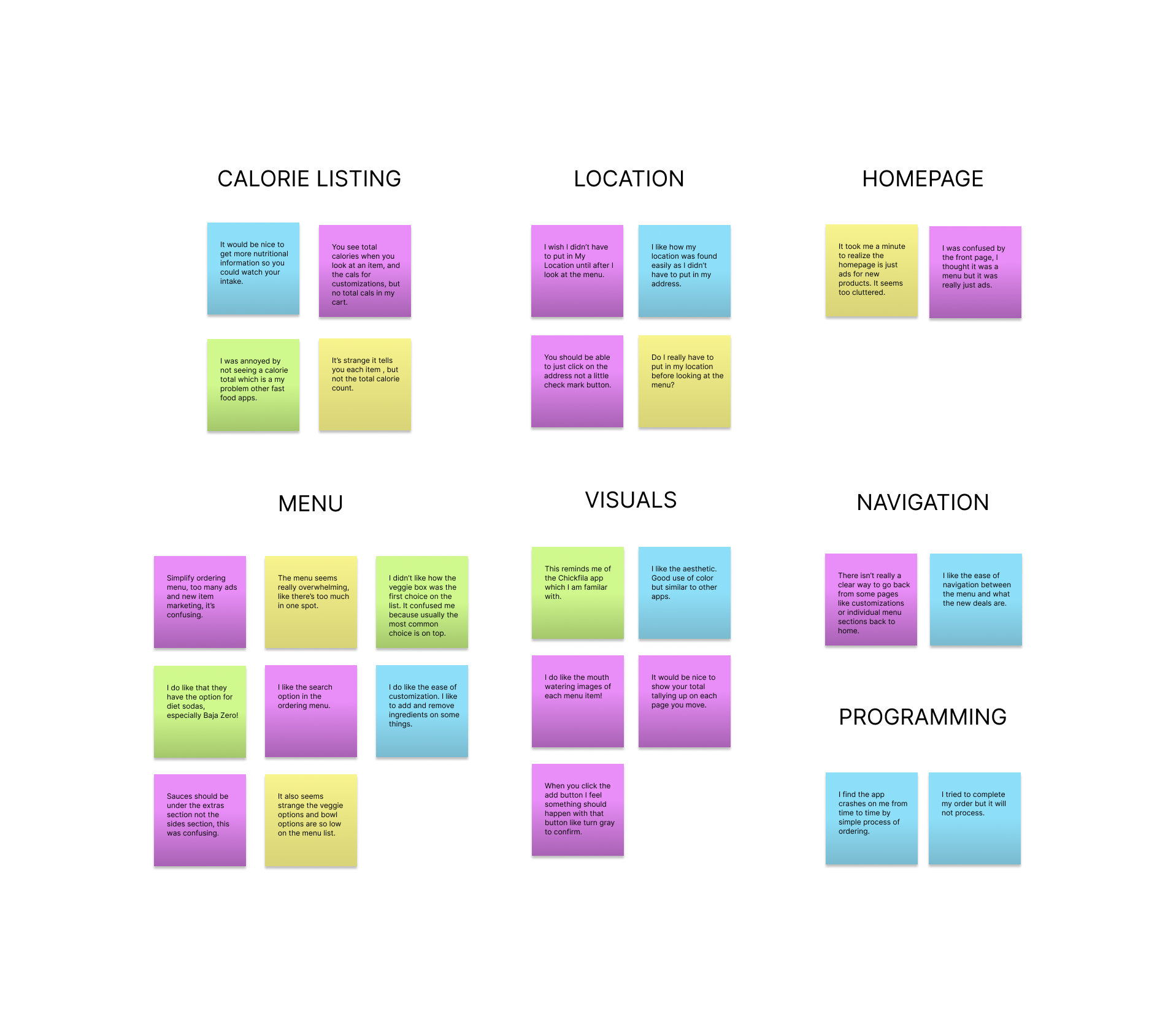
Usability Study Themes and Insights
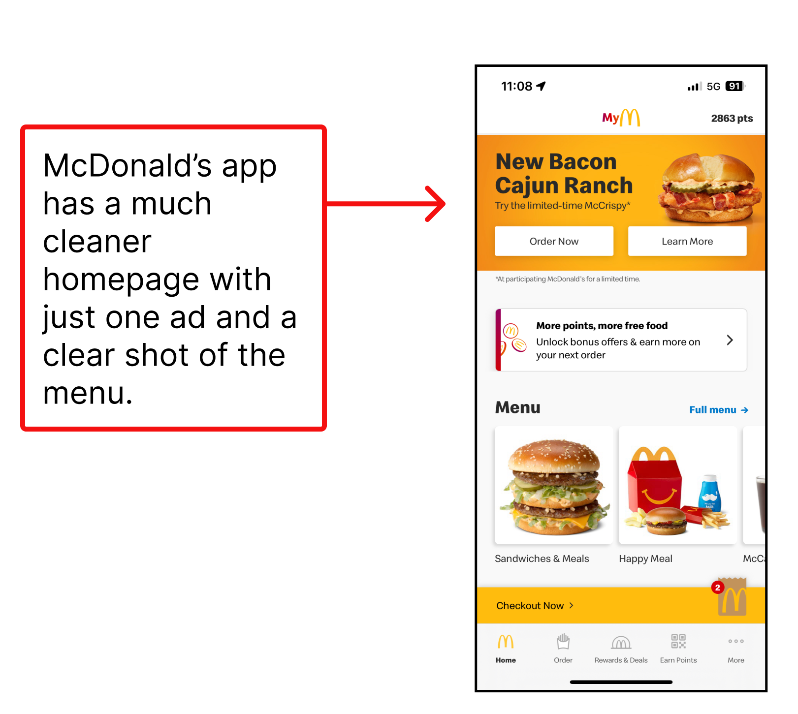
Theme 1: The Homepage
The users found the look of the page to be vibrant and pleasing but others found that it was too cluttered with advertisements for new products.
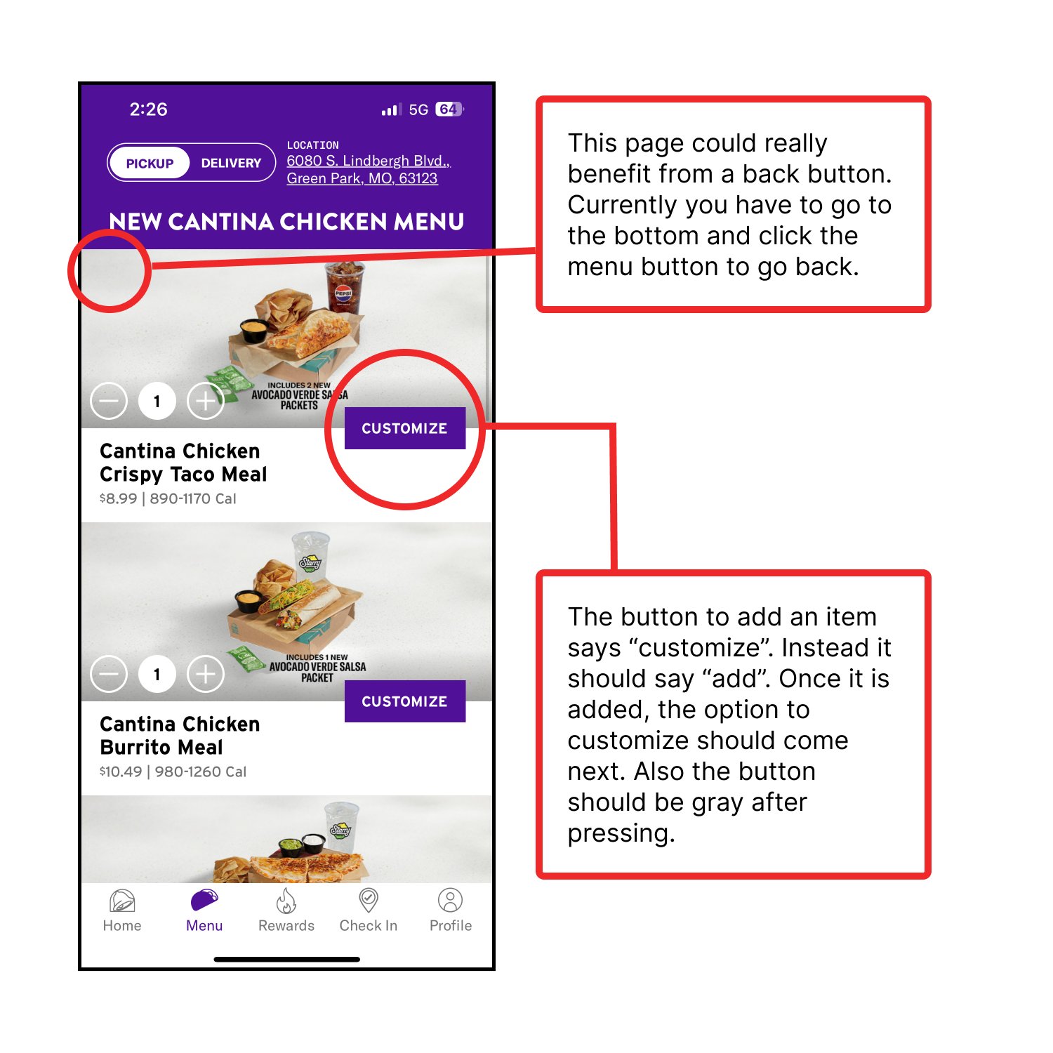
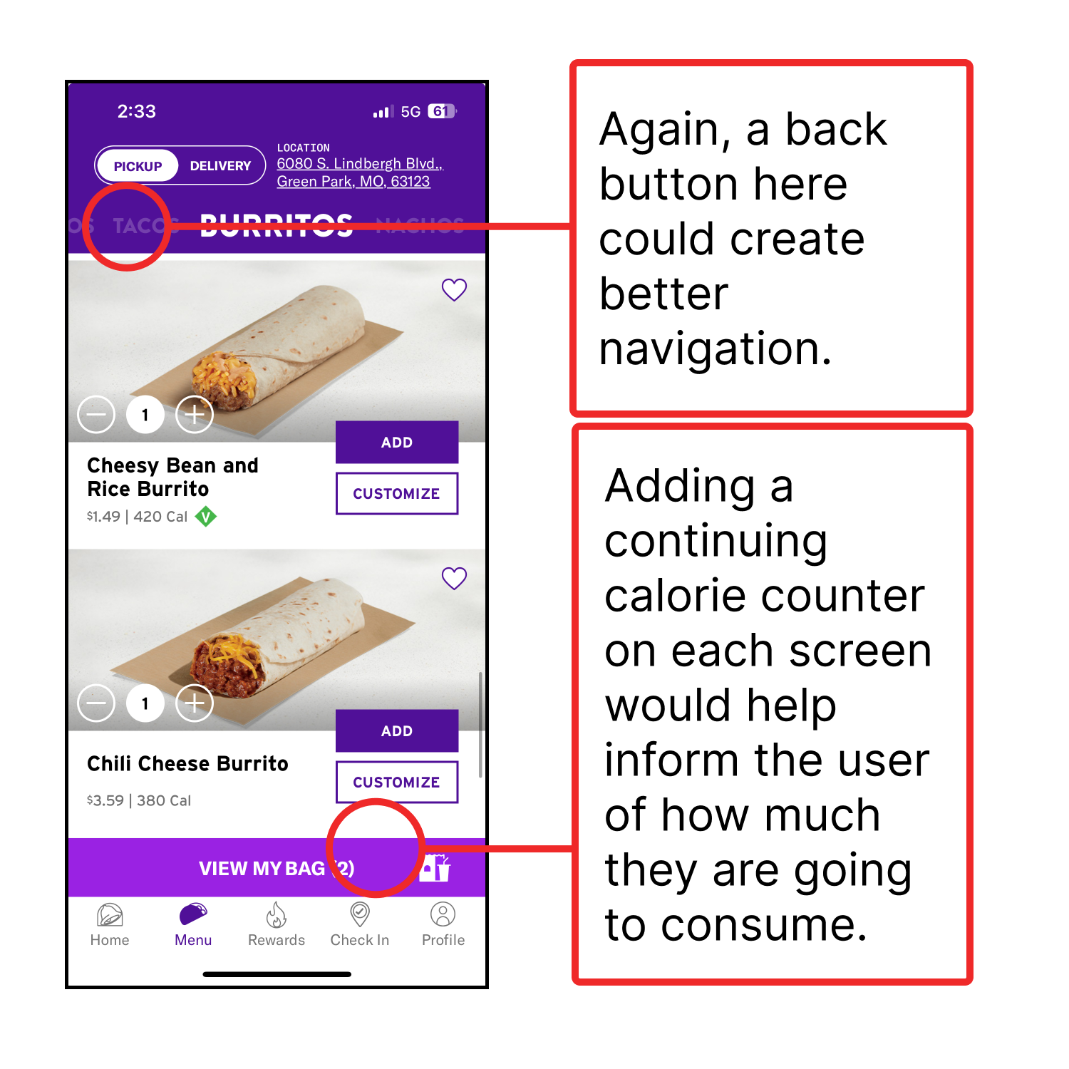
Theme 2: Menu
Some users liked the ease of customization on the menu and a search option. Others did not like the order of items listed and that it seemed disorganized with some items being in the wrong section.
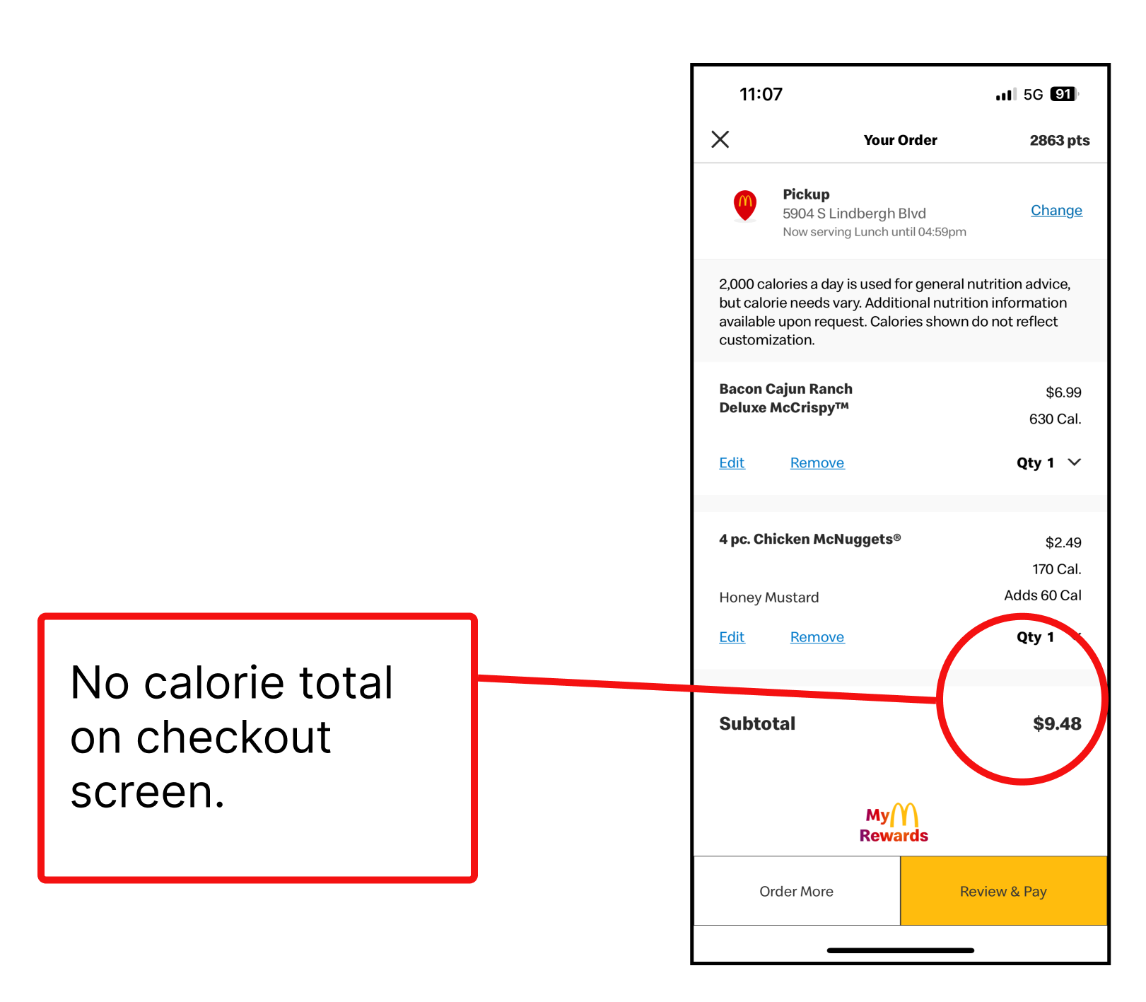
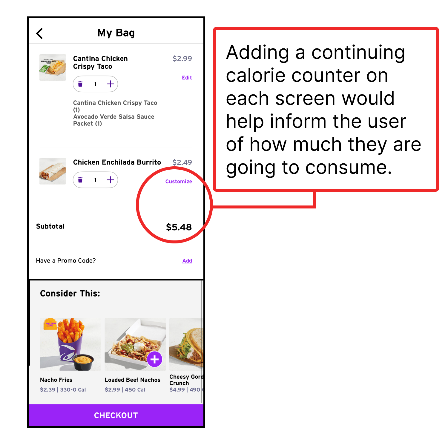
Theme 3: Calorie Listing
Some users were confused and disappointed that the calories for each item are listed but there isn’t a total.
Theme 4: Location
Users found it annoying when selecting to use the menu, they had to promptly find their location before browsing.
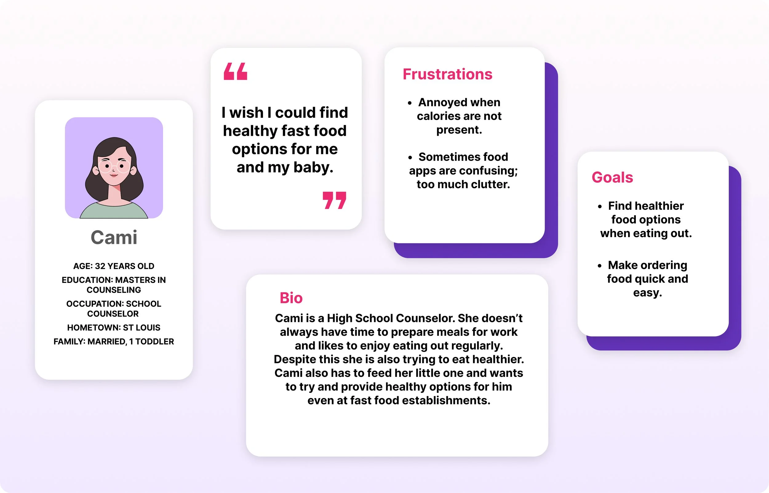
Personas
These personas were created using the 4 participant interviews.

User Journey Map
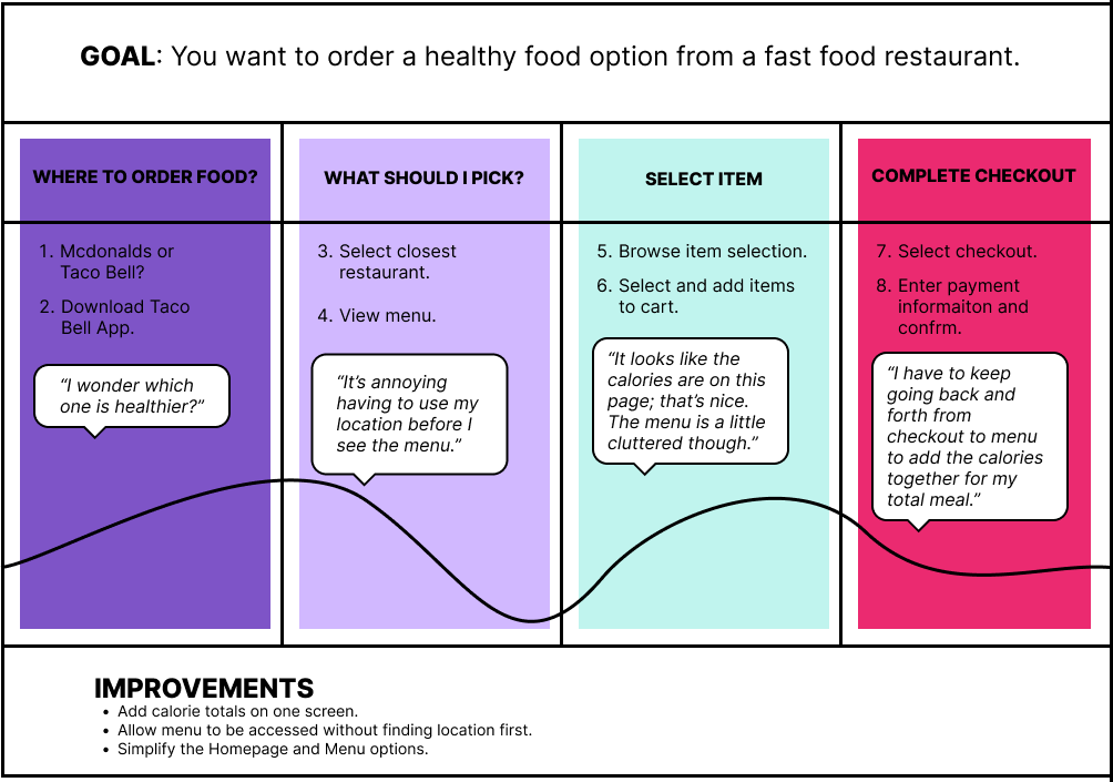
Problem Statement
Johan is trying to eat healthier and needs to know his total calorie intake because he is trying to lose weight.
Goal Statement
The goal is to redesign the Taco Bell app to let users see the total calorie sum which will inform users trying to be more health conscience and allowing them to be more selective on their order.
Pain Points


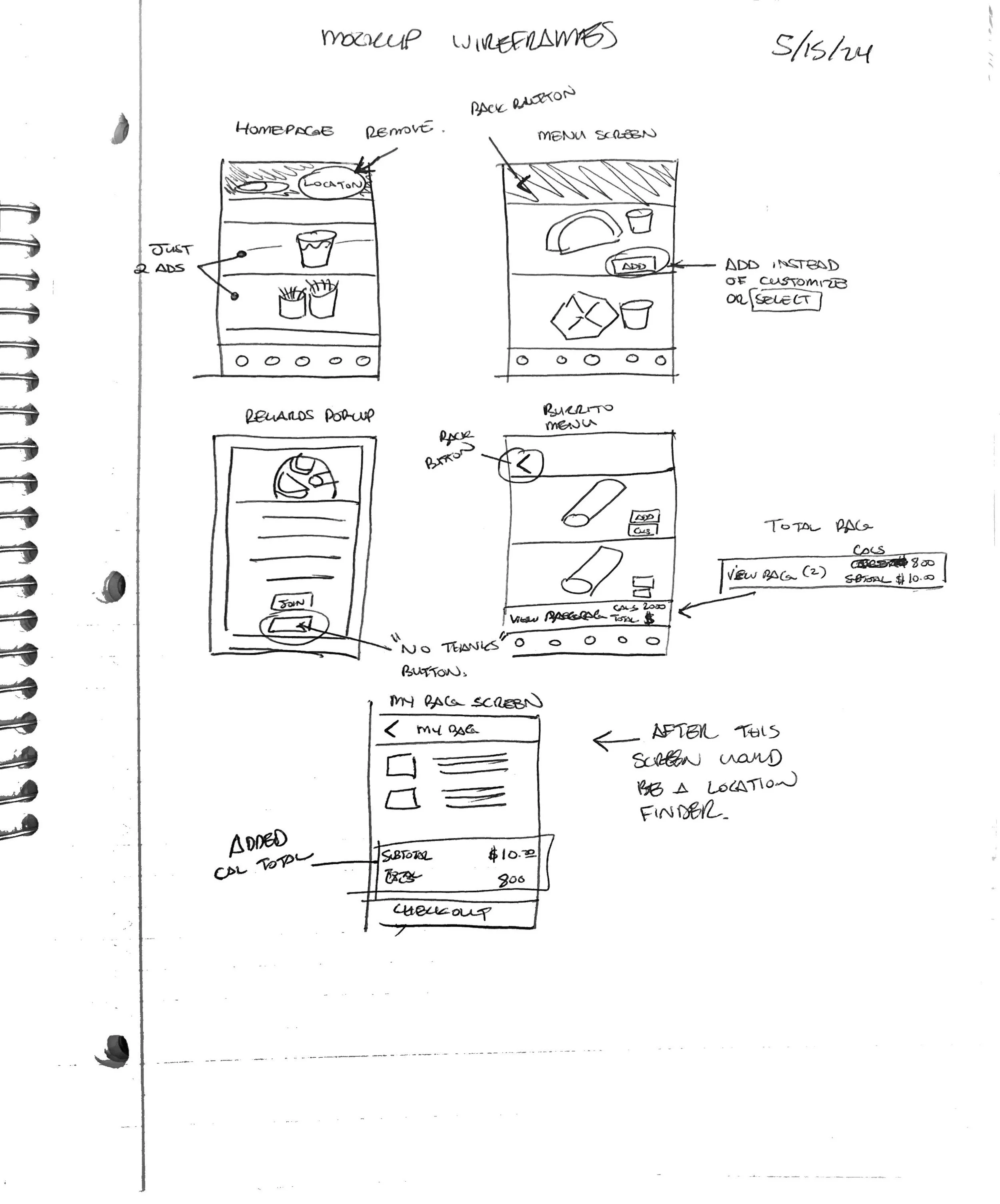
Paper Wireframes
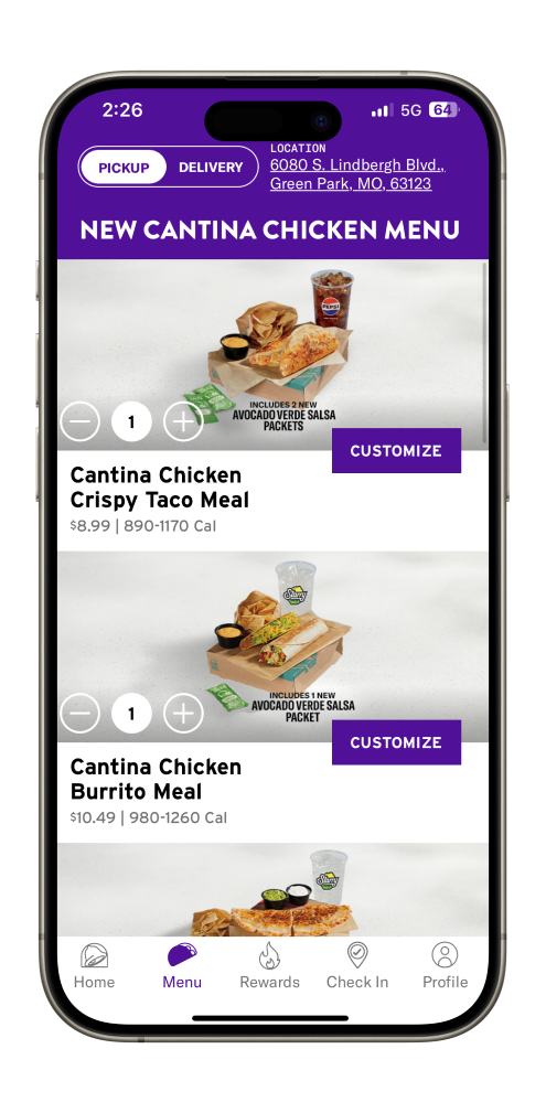
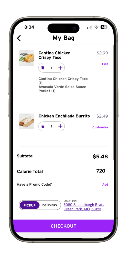
Redesign


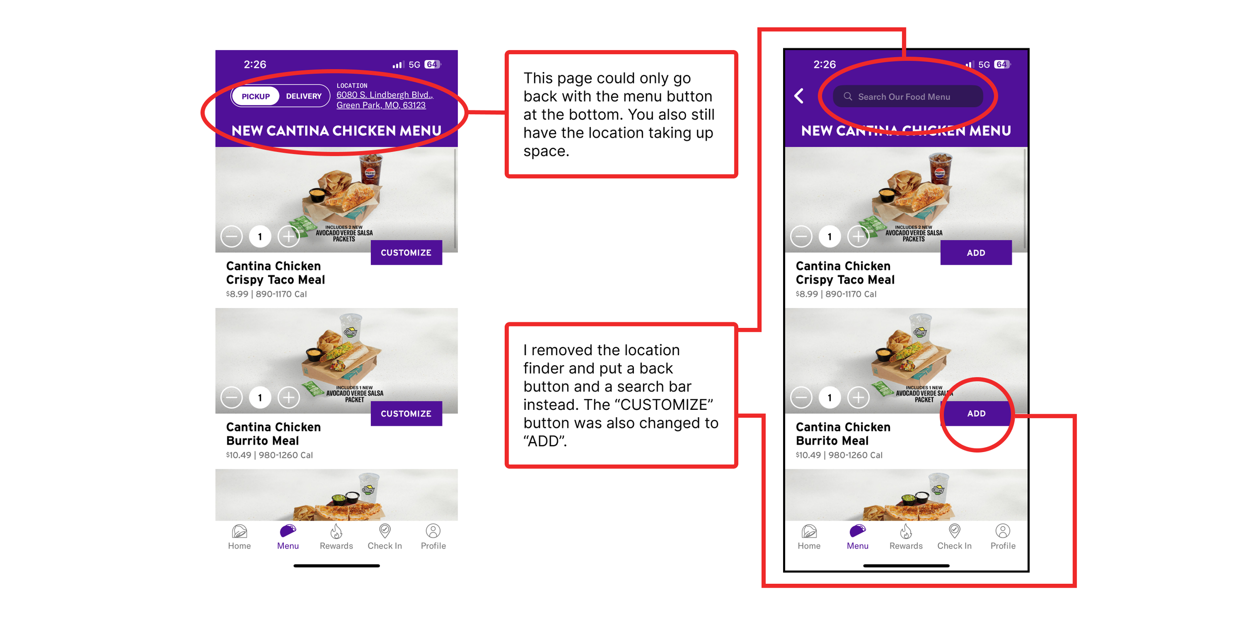


Final Mockup


What I Learned
I found this case study very different from the previous. I found the statistics very informative and eye opening to how much different age groups consume and how they order it.
Secondly, the usability study was helpful because of the different perspective it provided. For example some people disliked the same thing others really liked. This shows you have to balance elements without leaning to a particular side.
Lastly I learned how to take an existing product and manipulate it without having to completely rebuild it. I find it to be a very useful skill for creating mockups.